This summer, our Anatomy of a Logo series looks at 14 examples of how creative ingenuity combined with design and brilliant marketing to give birth to some of the world’s most celebrated logos
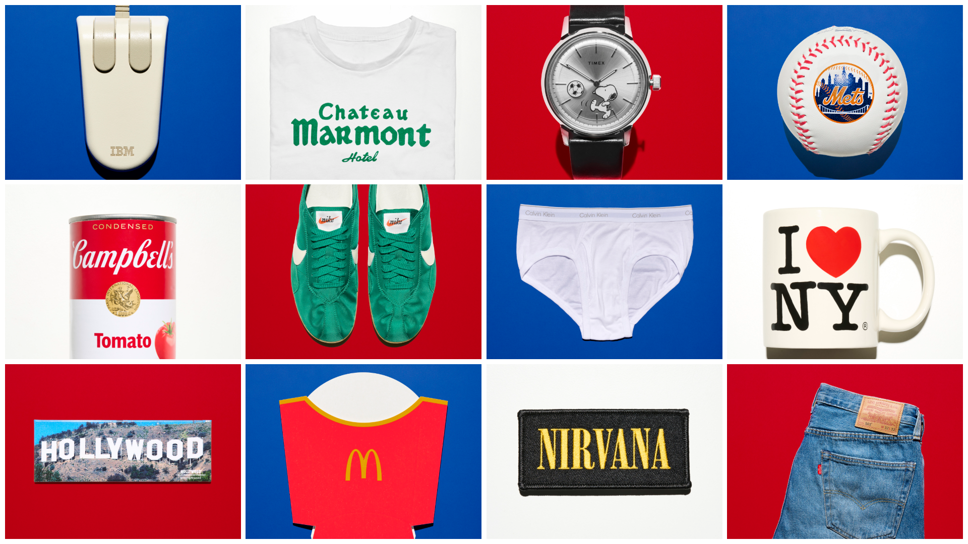
Making it in the land of opportunity has often required outlandish signage and bold graphical articulation. Here we have selected a series of American objects that bear instantly recognisable design statements that have stood the test of time. Is there something distinctly American in their combination of commerce and culture, or is successful branding simply a case of mass consumption meets volume marketing?
All the examples featured here have become acknowledged showstoppers in their respective genres, adorning everything from fashion and fast food to architectural wonders and waistbands, mashing up high art and commerce in wondrous combinations along the way. These are their creative stories.
14 American logos that made contemporary graphic design history
I ❤️ NY

By its sheer ubiquity, I Love NY may be the world’s most appropriated logo. Fifty years after it was introduced, it has become an all-purpose shorthand for allegiance and affection for anything, anywhere. Designed by Milton Glaser in 1976, it originally served as the graphic punchline to an ad campaign that helped rescue NYC from the brink of bankruptcy. Desperate to arrest its ballooning fiscal deficit, city officials funded the campaign to lure tourists back to the Big Apple. Doodling on the taxi ride from his home to the office, as he often did, Glaser drew a red heart paired with the letters ‘I’ and ‘NY’ rendered in American Typewriter, a slab serif with a 1970s flair, and worked with longtime studio assistant George Leavitt to slightly tweak it. Decades before the proliferation of emojis, some worried that the rebus-like construction would confuse people. Nevertheless, the city officials accepted the proposal, and soon made it the logo for the entire state. Copycats emerged almost immediately, but the state secured copyright, earning it tens of thousands of dollars in licensing fees each year.
…

The logo’s widespread popularity became Glaser’s calling card but also a kind of creative prison, with almost every article about him inevitably circling back to it. The 2009 National Medal of Arts honoree’s many other achievements include co-founding New York magazine, designing restaurants, and producing hundreds of posters, album covers and book jackets, as well as logos for Brooklyn Brewery, DC Comics, and Italian gelato maker Sammontana. Glaser, who passed away on his 91st birthday in 2020, never lost sight of the New York logo’s original purpose as a civic symbol. In the aftermath of 9/11, he appended it with the words ‘More Than Ever’, added a burn mark to a corner of the heart, and gave the grieving city a ready-made banner. The same poster re-emerged in shop windows and on food carts during the pandemic. In 2023, the city felt compelled to rebrand Glaser’s logo, but the flood of complaints confirmed one thing: a ferocious affection for the original. Text by Anne Quito
New York Mets

Selected by a public competition, the design for the New York Mets logo, unveiled in 1961, was the work of illustrator Ray Gotto. Though the baseball team would play in Queens (as rivals New York Yankees were based in the Bronx), Gotto sensed that an emblem that could unite the entire city was needed, so he drew a symbolic New York skyline using a medley of landmarks from various boroughs, including the Woolworth Building, the Empire State Building and the UN HQ, while a suspension bridge anchors the composition. Originally rendered in black and pink, the palette was later revised to blue, orange and white, colours that also echo New York City’s flag. In the decades since, the Mets have cycled through owners, managers, stadiums and uniforms, but Gotto’s logo remains a fiercely guarded emblem. Text by Anne Quito